Some couples argue about money, intimacy, religion, and things like that. But for me and my girlfriend, our most contentious topic of the month has been the value of pie charts.
Leila’s position is that any data that can be presented as a pie chart can be presented better in some other format. A leading faculty member in her department — a truly brilliant woman — agrees wholeheartedly. But I’m sure they’re wrong, for reasons explained elegantly by Bruce Gabrielle.
Gabrielle’s advantage #2 of pie charts, “Communicates parts-to-whole relationships better,” is the one I consider most important.
At a glance, you know a pie chart is splitting a population into parts.
Bar charts do not have the same meaning. You can signal to the reader the bars add up to 100%, by adding a column or an annotation. But this requires some extra mental gymnastics by the reader to understand the bar chart represents 100%. Nothing beats a pie chart for instantly communicating 100%.
I’m sure this is why pie charts are routinely used to introduce fractions in elementary school. The format is easily grasped by anyone who has ever divided up a pie (or a cake). Does any other type of graph connect so well to a common visual from everyday life?
While I lack Gabrielle’s experience in presenting data to executives, I do present data all the time. And while I rarely include pie charts, I claim that there is a time and a place for them.
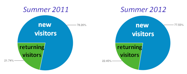
About a year ago, I put together some slides about my website SingAboutScience.org for a potential collaborator. One of my points was that recent improvements in the website had not caused an appreciable increase in the fraction of website visitors who returned for multiple visits. A pair of pie charts helped make the point quickly and clearly.
Or so I thought. When I described this example to Leila, she did not find it compelling.
At any rate, this beats arguing about money.

Leave a comment